planning + ux
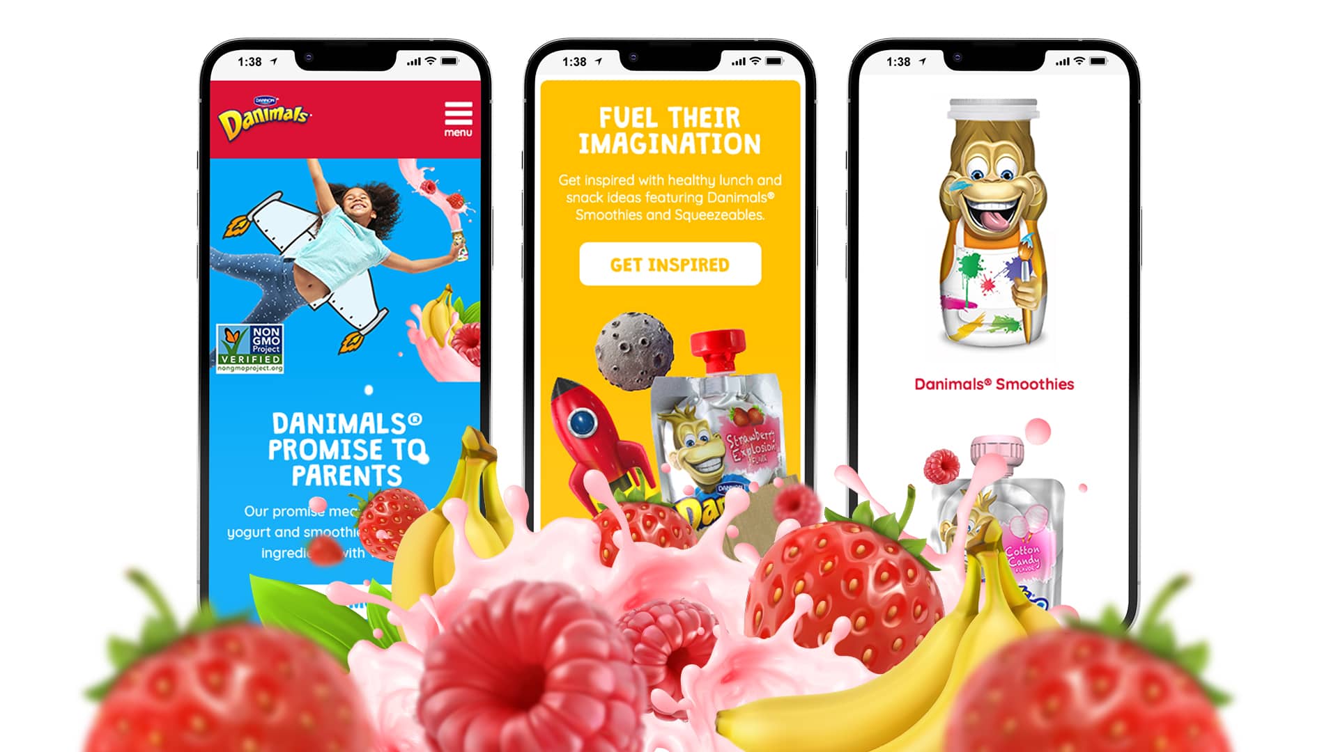
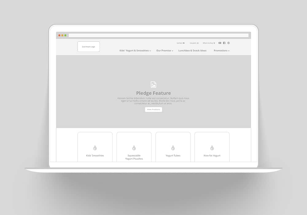
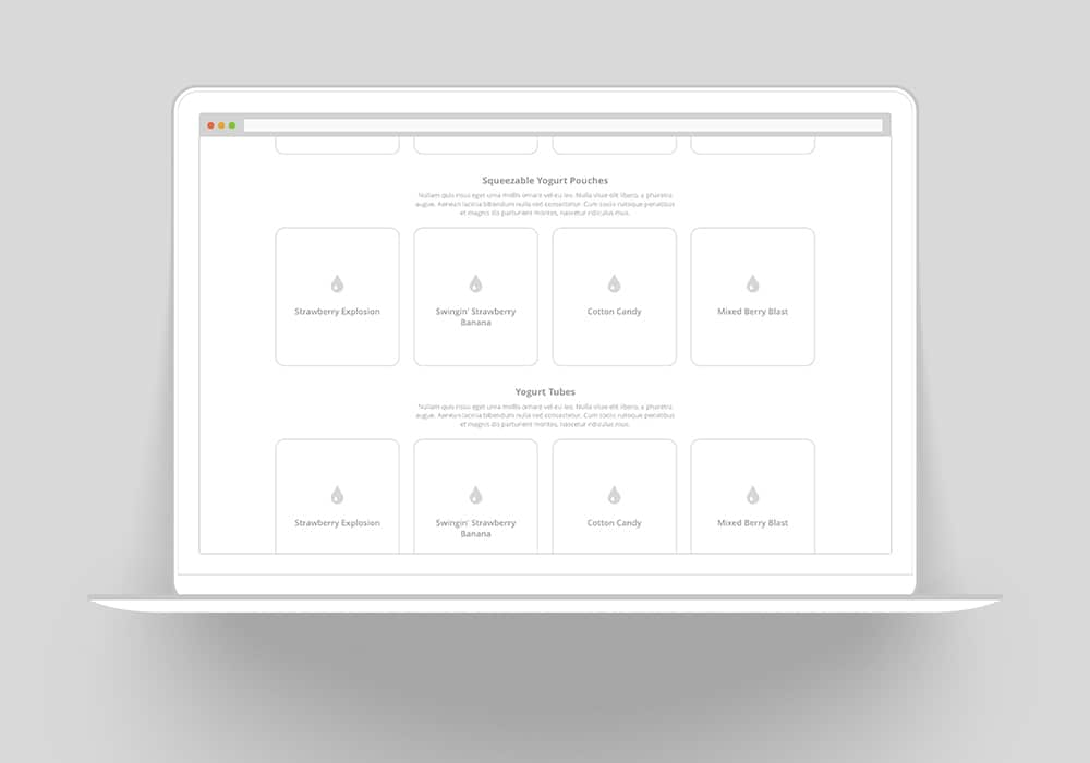
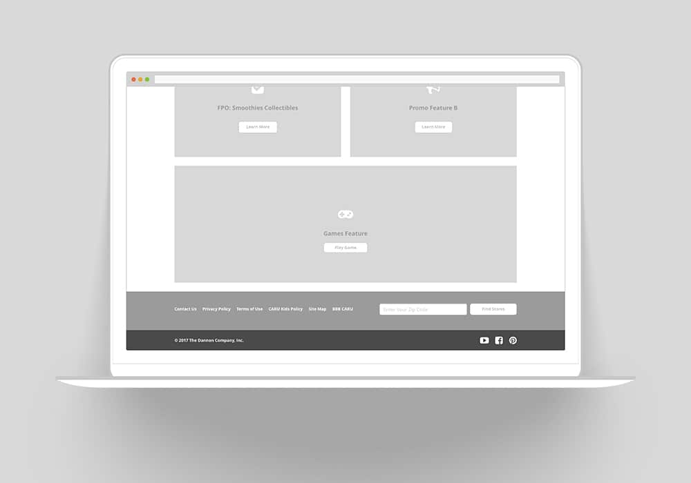
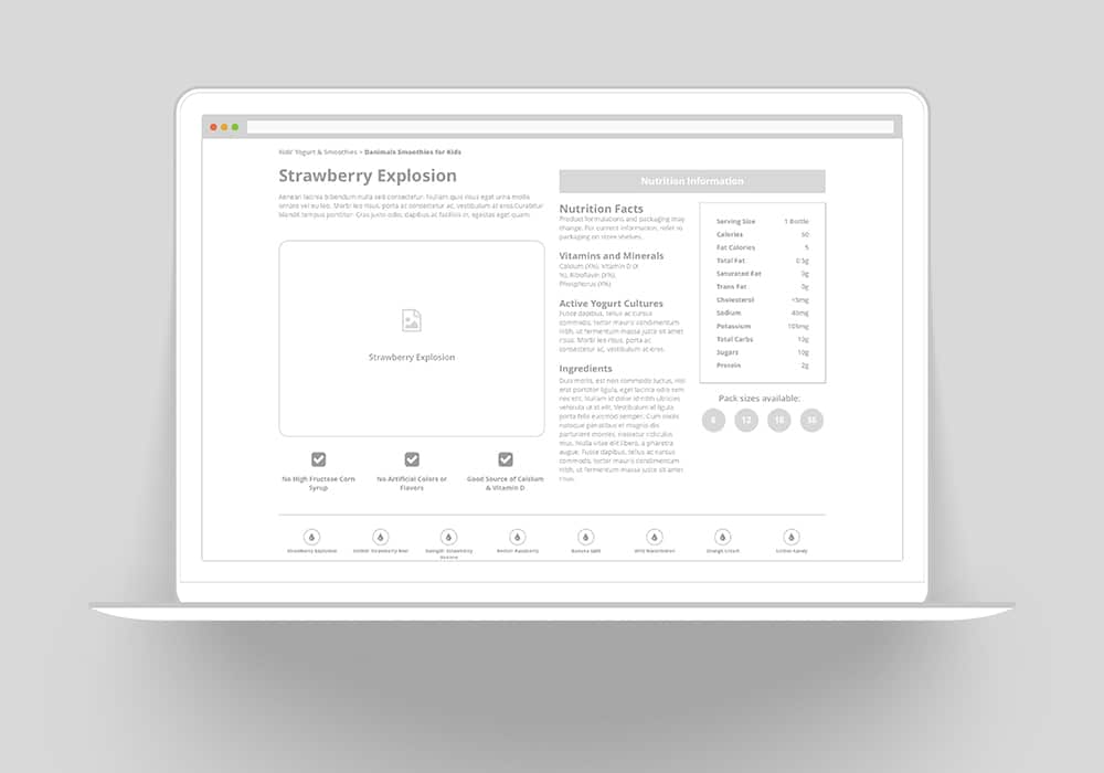
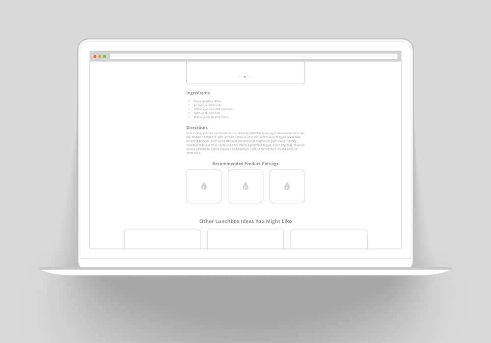
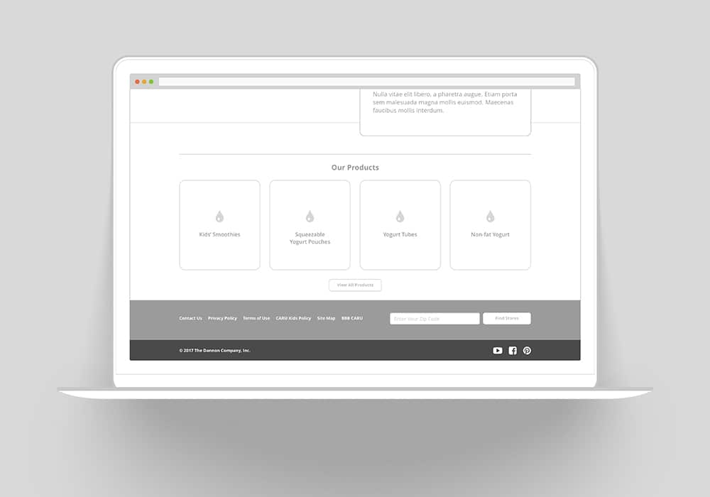
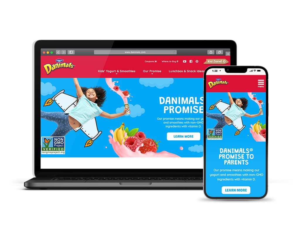
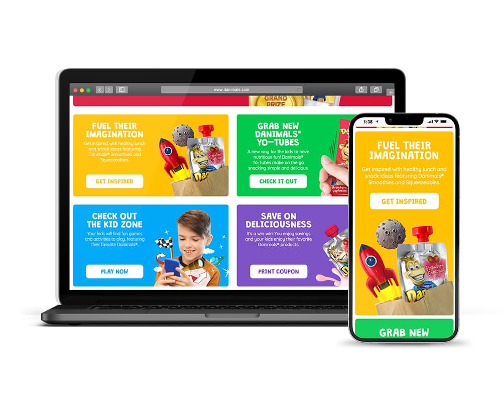
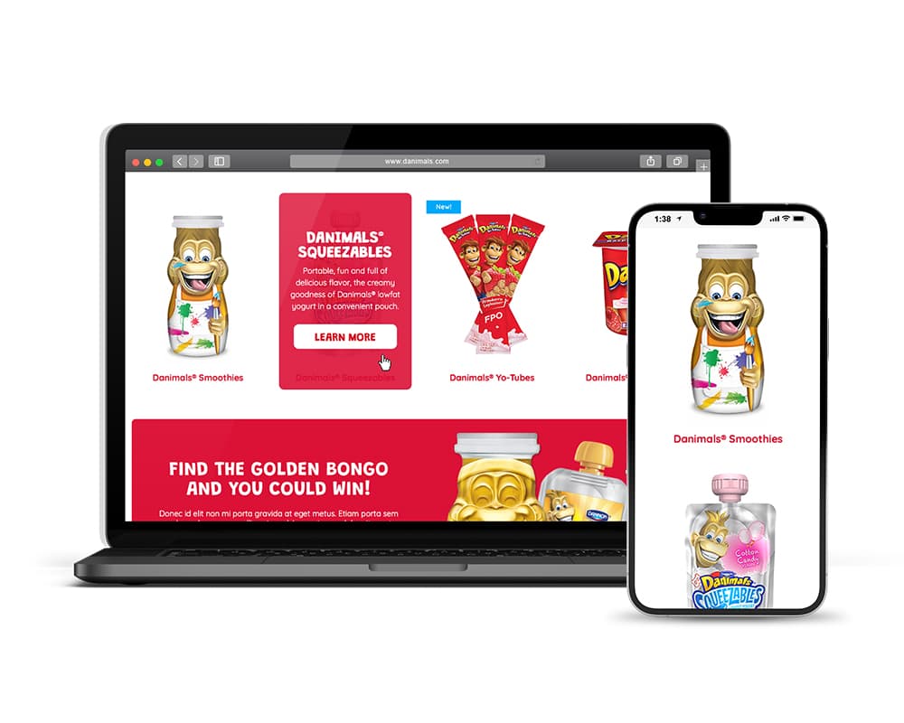
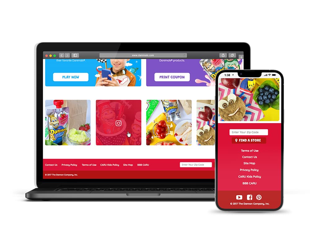
To complement marketing needs and high-level usage data, the site was designed to handle the core elements of the brand: 3 categories of products (plus individual flavors), product detail (with prioritized nutritional information), seasonal promotions, recipe content, ingredient sourcing information, and a section for branded kids' games—both digital and printable. The website was designed responsively and planned around the perspective of various "mom" personas: busy, on-the-go people of varying income levels, with ingredients and kids' nutrition top-of-mind.
