ed adams

CREATIVE DIRECTOR +

maker
artist
dad-joke-teller
code fiddler
photographer
web/ux designer
Motion artist
illustrator
Designer
Ed Adams: Creative Direction, Design, and Illustration logo
EA monogram logo

ParkFast Site + UX

Edison ParkFast has been providing unparalleled parking to the people of New York and New Jersey for over 60 years. With parking lots and garages across Manhattan and just over the Hudson, ParkFast is regarded as a trustworthy and cost-effective parking provider. We were tasked with research, UX, and overall UI design of parkfast.com.
Creative Director
Ed Adams
UX Director
Saygun Erkaraman
PM + research
Chris Murphy
ACD
Joey Tutalo
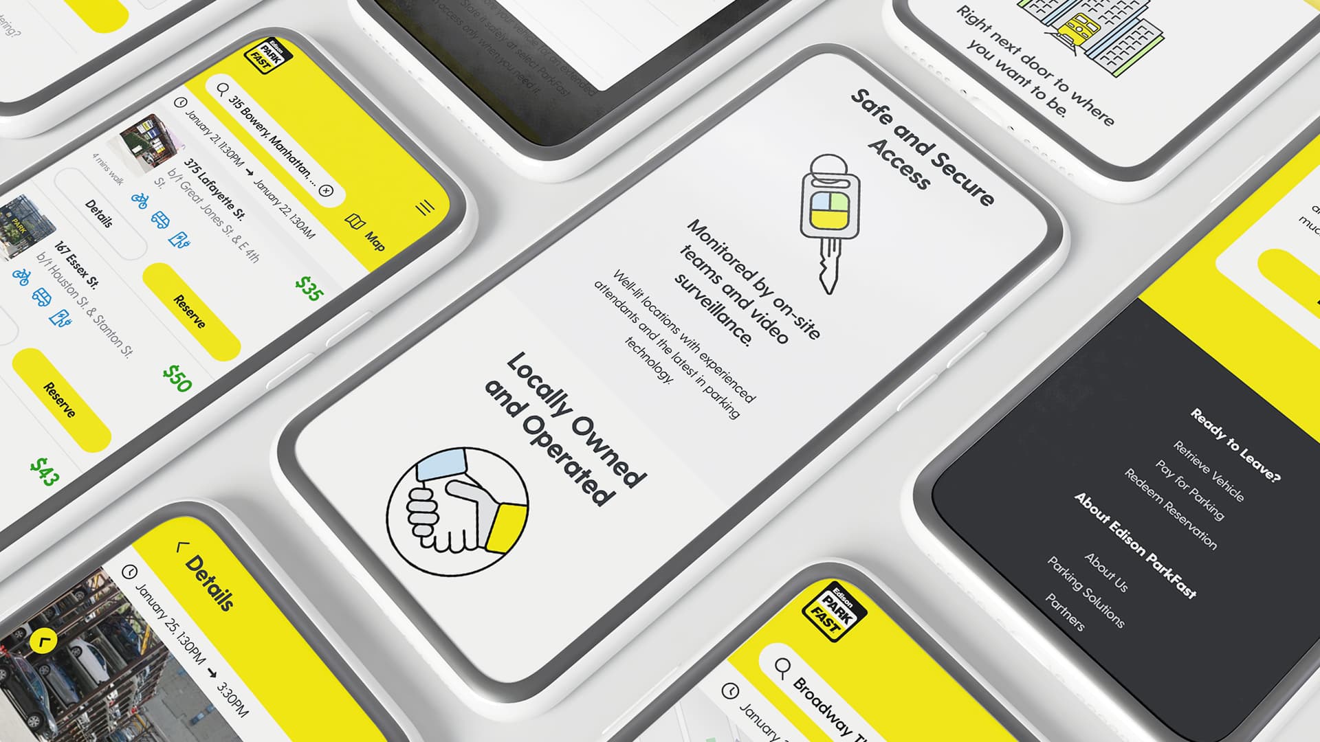
iphones with different parkfast.com screens

Personas + user journeys

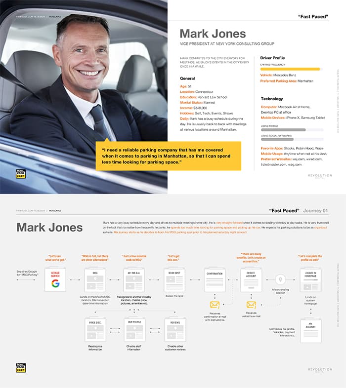
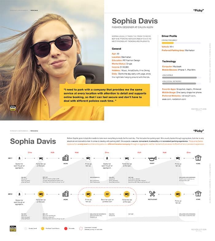
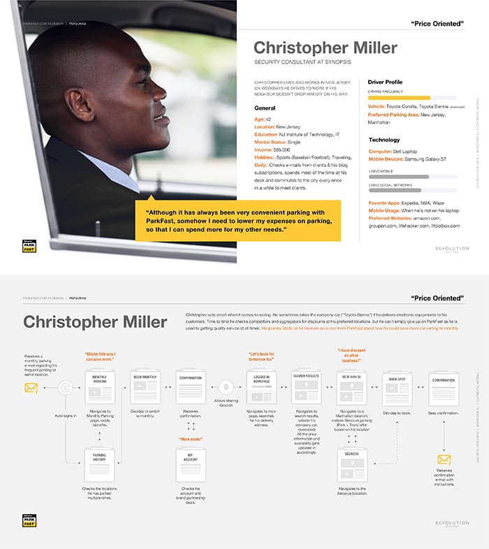
When ParkFast started the process, they were focused on improving all aspects of their website with a clear focus on driving traffic away from parking aggregators and into their own site for reasons of customer retention, loyalty programs, and profit (aggregators take a large percentage of sales). With users, we found that a simple, streamlined process, a brand reputation for friendliness and safety, and overall perceived value were paramount. Personas were then structured to predict user flows across age, professions, and activity groups—all geared toward a simple process online and IRL that lowered key moments of high anxiety that were found in the aggregators' and competing lots' processes.
persona Mark
persona Sophia
persona Christopher

style tiles

As research and planning continued, we jumped into some high-level creative exploration in the form of style tiles. Working this way ensures that we weren't stepping on the more technical parts of the UX process and/or confusing the client with UI designs that aren't yet married to the results of that phase—mainly information architecture and wires. It also helped streamline part of the process on the creative side, allowing us to explore the brand, enhance it, and experiment without excessive technical concern.
parkfast style tile

wireframes

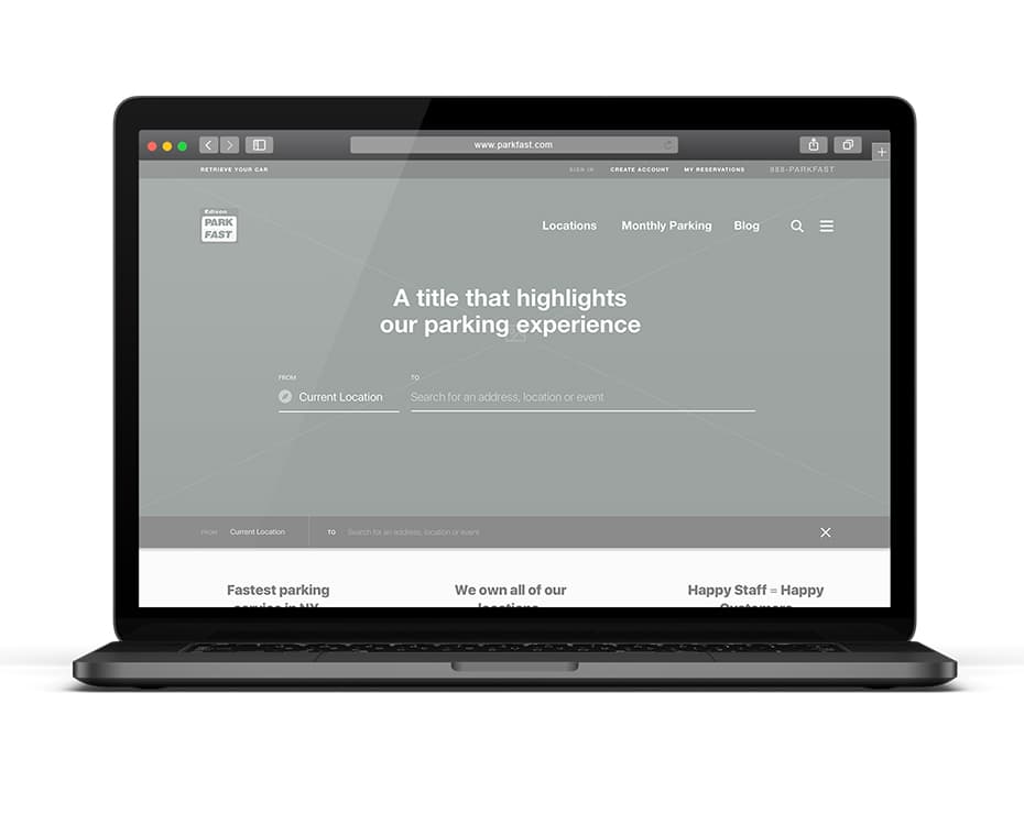
Initial wires were started after we aligned on initial research and personas. Though the process was abbreviated, which you'll see in the next section, this started the conversation about site structure and ultimately lead us into the next phase of design. Wireframes primarily designed by Saygun Erkaraman
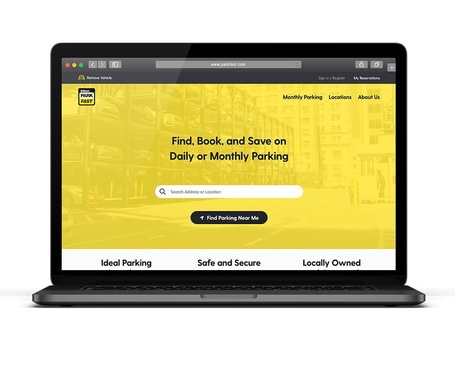
parkfast wireframe homepage on laptop
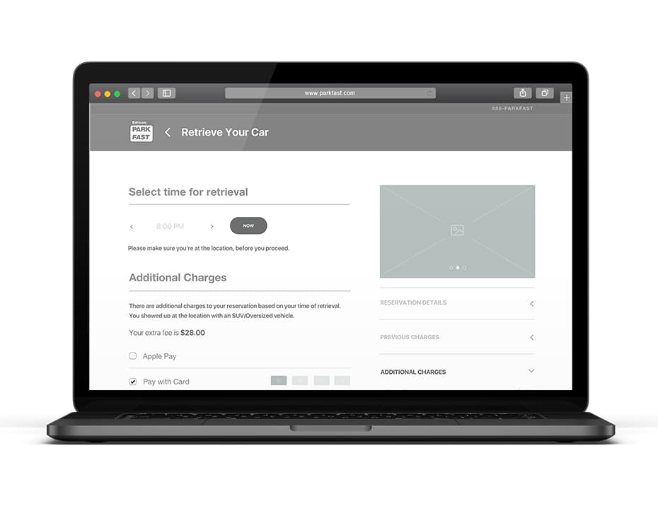
parkfast website wireframe retrieval flow on laptop
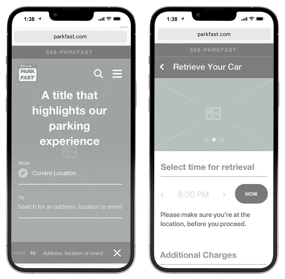
parkfast mobile wireframes on iphones
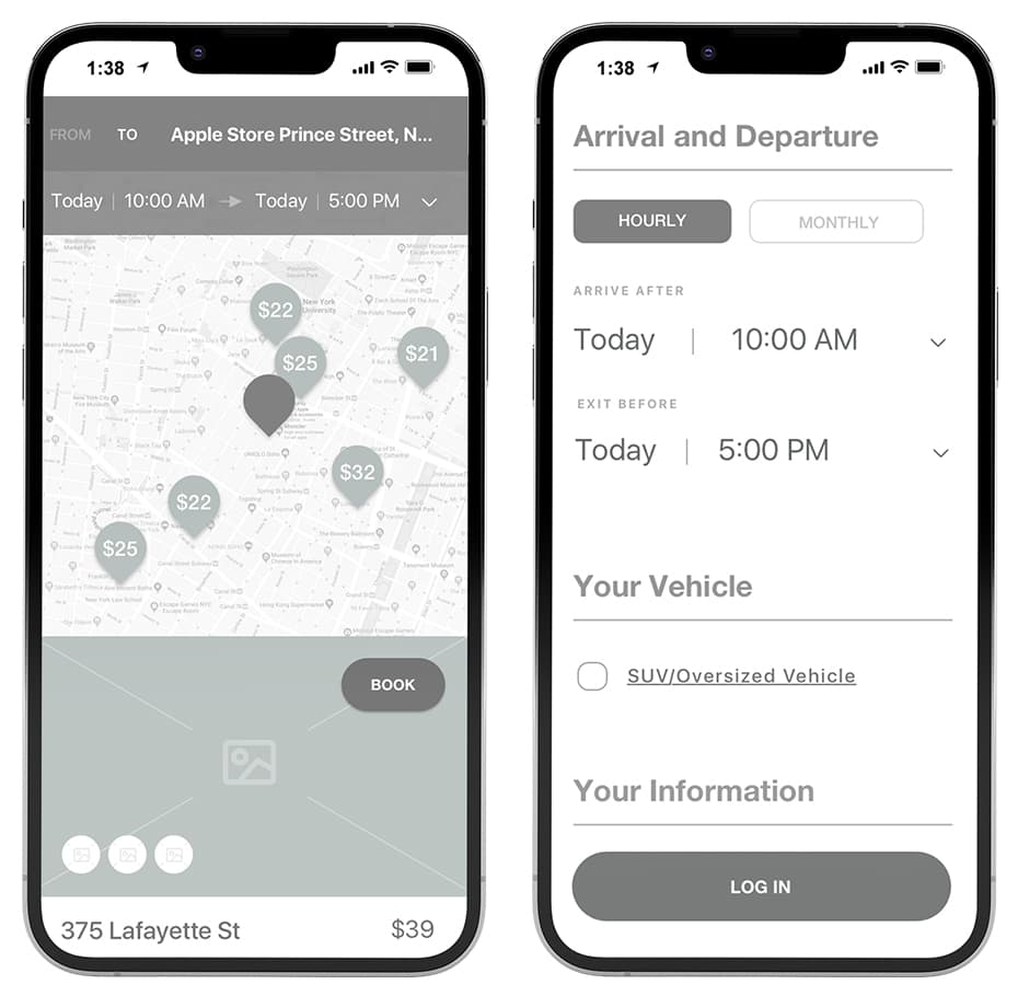
parkfast mobile wireframes for location on iphones

high fidelity designs

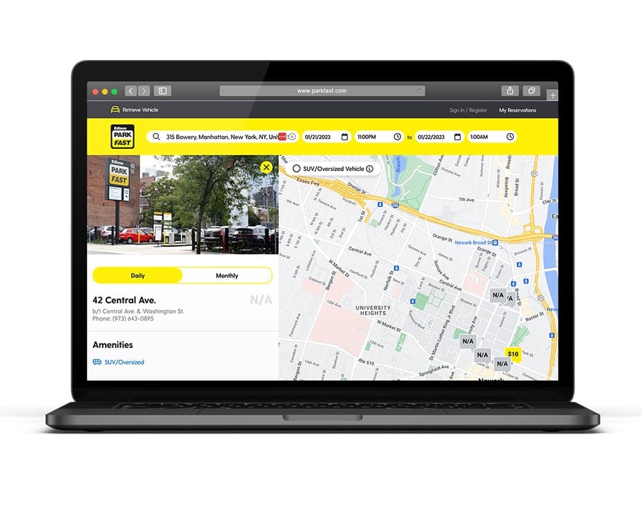
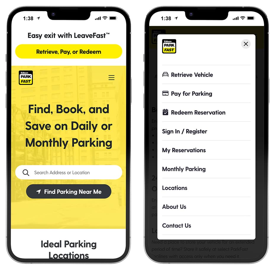
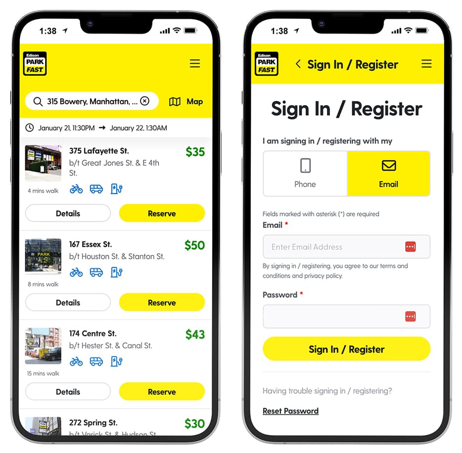
After the initial UX was complete—research, flow, sitemaps, and initial wires—we continued the design process into high fidelity designs that were prototyped live from Adobe XD. Given the number of stakeholders and the lengthy initial UX process, we found that presenting extensive wireframes were slowing the schedule too much, so we opted to jump directly into high fidelity designs. All development was done in-house at ParkFast, so we handed off a final package of page designs and global styles to their developers.
ParkFast website home and on desktop
ParkFast website location and map on desktop
ParkFast website home and menu on iphone
ParkFast website search results and registration on iphone

Design system + style guide

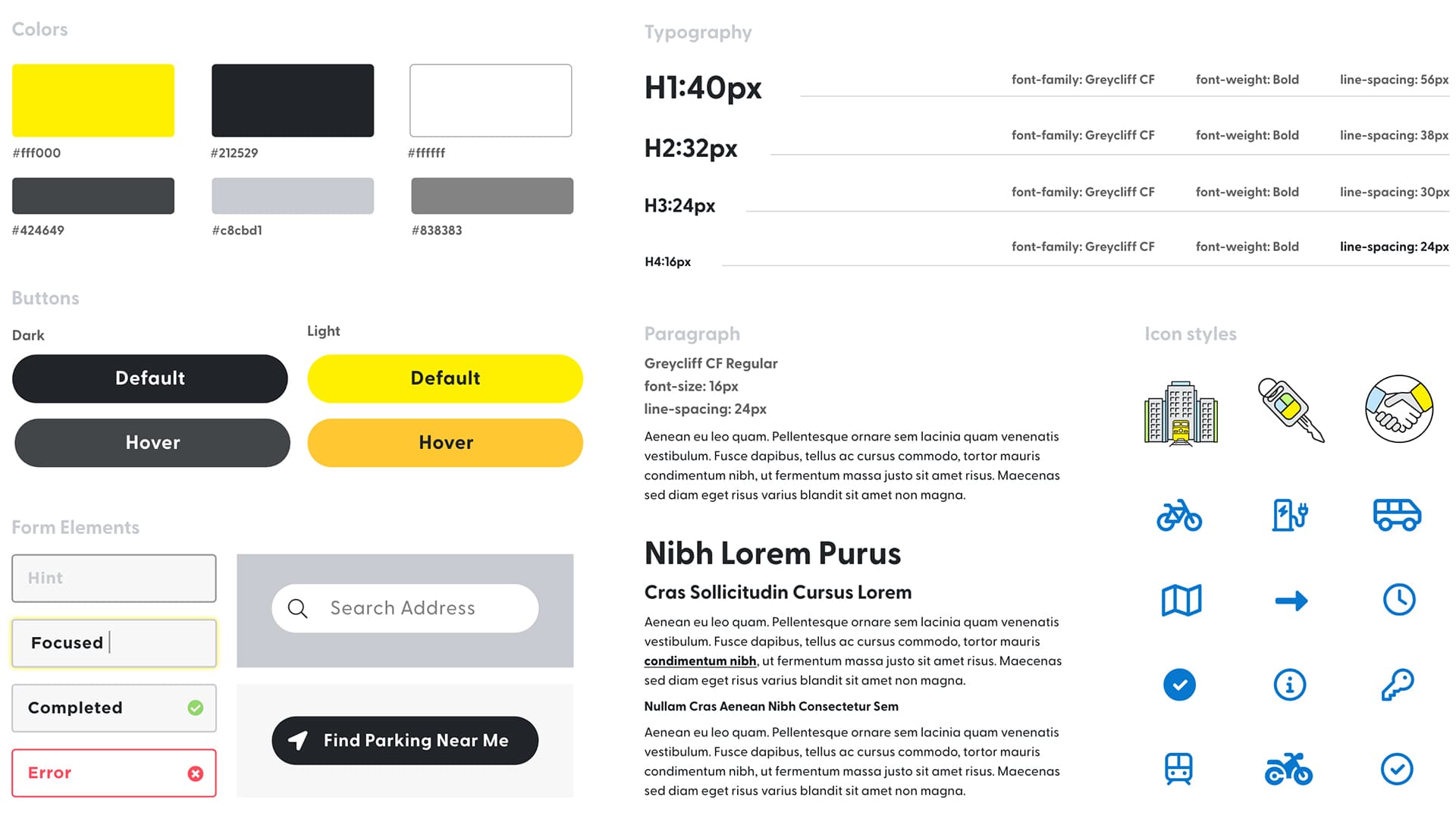
Since the development was done in-house at ParkFast, we handed off a complete style guide to keep the design system streamlined and consistent. Colors, typography, input/form elements, page/column structure, and icons were provided as a starting point to inform the immediate development and most future additions to the site.
ParkFast style guide

behold, more work:

Ed Adams is a hands-on Creative Director, designer, illustrator, and motion graphics artist hailing from the highlands of New Jersey. All work and content is Copyright © 2024 Ed Adams and their respective brands.
Menu